Thursday 24 March 2011

Evaluation question 7: Looking back at your preliminary task, what do you feel you have learned in the progression from it to the final product?

After completeing both the preliminary task and final project, I hvae learned that creating a magazine is not just a case of how good it looks and how well it is written. I have learned that the process of coming up with ideas on how the magazine actually attracts the attention of the target audience within demographical and psycographical groups. This has helped me learn that it is very rare to find a manufactured product that would please all groups due to conflicting demographics and psycographics.

As well as this, I believe that my skills in image editing have dramatically since the preliminary task up until now:

Evaluation question 6: What have you learnt about technologies from the process of constructing this product?

Evaluation qusetion 5: How did you attract/address your audience?

Below is how individuals in the age range of my target audience reacted to my final peices:


From the interviews, I have concluded that the vibrant colours attract the audince's attention. This shows that I have fulfilled my objective to make my magazine stand out if they were to be displayed in a shop.

Evaluation question 4: Who would be the audience for your media product?


The age range my magazine is aimed at is teenagers between the ages 14 and 18. The majority of individuals within this age range are students which means the vast majority of them fll into demographic group "E" which is the lowest group on the list consisting of the unemployed and students.

As said before, the psycographic group my target audience falls into is "explorers", so to suit their niche taste, I had to create an appearance which would stand out from other magazines and I believe the Dupstep genre would attract them as I believe it meets the criteria of an "explorer's" product.

Evaluation question 3: What kind of media institution might distribute your media product?


I believe that IPC media would be the best choice for distributing my magazine. Despite being the UK's largest magazine distribution company selling many mainstream magazine titles, it also has quite a large focus on niche magazines which I believe would help the magazine as well as the genre itself into the mainstream market with such a big name behind it.

Evaluation question 2 :How does your media product represent particular social groups.

Allot of the time, people are generalized on the products they consume (for example, someone who drives an expensive sports car would be seen as rich and succesful).

In the case of this magazine where it focuses on such a niche genre, I believe it represents the niche audience who would fall into the phsycographic group of "Explorers" who, in brief, means consumers who explor "new frontiers" as well as their brand choice highlighting difference. As well as this, the age group they fall into is "young student" which is in the same range as my target audience. My niche product also seperates my audience from the biggest psycographic group, the "mainstreamers" who are seen as the mass audience usually consuming what the majority choose. As Dubstep has not yet entered the mainstream market, it is extremely likley that niether will my magazine.

As well as the genre my magazine focuses on, the content of my double page spread also represents my audience in way that readers are not just followers and fans of the style of music, but also creaters. The article guides readers on how to start out becoming Dubstep artists themselves. This represents the audience as being part of the Dubstep community not just as fans/followers but also as creators and artists.

Wednesday 23 March 2011

Evaluation Question 1: In what way does your media product use, develop or challenge forms and conventions of real media products?

As a group, we chose Dubstep as a genre to focus on for our magazine. When researching for excistng Dubstep magazines, we found no magazines which focussed on Dubstep primarilly which is understandable as Dupstep still remains as an "underground" based culture and it is only in the last two years has begun to emerge into the mainstream market so for the time being, Dubstep remains in the niche market.

As my magazine would be the first to primarilly focus on Dubstep, it would naturally have its own conventions to suit the style of music. An example of this would be a magazine dedicated to grime using a graffitti font to link back the genre's urban roots.

So for my magazine to do this, I had to pick out a typical element of dupstep which I could link back to with my magazine so chose to focus on the most noticable element which is the boldness and loudness of the genre as it is a style of music which is mainly enjoyed being played at a high volume.


From looking at the front cover, the audience can immediatley see the striking colour scheme consisting of bold shades of blue, red and black. On a display in shops, I believe that the front cover would stand out to the audience due to this unusual yet "loud" colour scheme. So, for the case of the front cover, I belive that this particular piece uses its own conventions in a way to convey the genre it focuses on through its apperance.

However the layout is more of a typical convention as, like most existing magazines, the main articles are featured on the front cover:


As for my contents page, I believe that unlike my front cover, it has a more conventional feel to it:


Starting off with the articles, you can see that they are in list form which is a very common convention within existing magazines:


As well as this, there are also photos with captions underneath which link to some of the main articles which is also a typical convention for magazine contents pages.

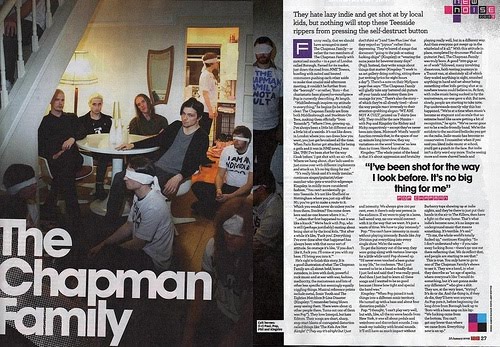
The the case of my double page spread, I beleive that it had elements of traditional conventions in trems of layout as well as once again developing its own connventions to relate back to the nature of Dubstep in terms of image editing.

For example, I find that the layout is conventional having text on one side and then an image/images on the other. This layout can be seen on existing double page spreads:


As can be seen between my double page spread and an existing one, this convention is quite common where one page is mainly images and the other is mainly text

However, as well as consisting of conventional aspects, there was also elements of new conventions. For exmple the image on the right side was a combination of two images (the photo of the artist and the speaker) thus creating an entirley new one. This was also a link back to the genre of Dubstep as Dubstep is a genre where two or more different tracks are combined to make a new one.

Sunday 20 March 2011

Tuesday 15 March 2011

Improvements to magazine

After creating my first draft, I disscussed the areas of improvement with the members of my group as well my teacher for my front cover, contents page and double page spread.

Firstly, I will be changing the name of my magazine from "DubDog" to "Bass Cannon" as I believe it has more of an impact on the audience as well as being a more sophisticated suggestion of the genre of dubstep.

As said before, I am not very confident with image manipulation software however after having created my drafts and experimenting with a programme known as "GIMP 2.6", I feel more confident that I can create more professional looking work.

Looking at my contents page, I realised that it made the magazine look very thin due to the lack of articles. Therefore I will include alot more articles for the contents page to thicken the magazine.

Grammer errors will also be corrected.

Tuesday 8 March 2011

Contents page 1st draft


The colour scheme matches my front cover and double page spread. There is also basic use of image editing. However, to improve on the contents page, I must add more articles to it as currently having 6 articles makes the magazine apperear very thin and short. So to make the magazine appear to be of normal magazine length, I must add more articles.

Double page spread 1st draft


As can be seen, the colour scheme is similar to the front cover showing a consistancy throughout the magazine. I have also cut small protions out of my photos and rearranged them to create a new photo. However, dispite this there are afew noticable grammer errors which I will have to correct when making the final version.

Sunday 6 March 2011

Front cover draft

This is the draft for my front cover. Although being very plain and basic, it will be the foundation of my final piece as I will maintain a certain aspect such as colour scheme, main image and font masthead included in this first draft.