For this project, I was given the task of creating the front cover of a school magazine however before I could get started; I had to research the conventions of magazine covers and what made them attractive and appealing to their target audiences. For this I researched different magazine covers observing features such as the title/masthead, colour scheme, font, main image etc. I learned from researching these features of the magazine covers, that they were very important in informing audiences what the magazines were about. For example, an image of a car would suggest that the magazine’s main focus is cars. For the second and final part of the research process I had to develop a questionnaire on what attracts someone to a magazine and sent it to my target audience (students aged 11-18).From my results, I learned that the current school magazines did not have news on current affairs which students could relate to or were interested in. I took this information and adapted it to the content of which I will focus on current affairs (e.g. tuition fees (a huge affair concerning students at the time) and school life in general which affects all students who happen to be my target audience) concerning and attractive to students.
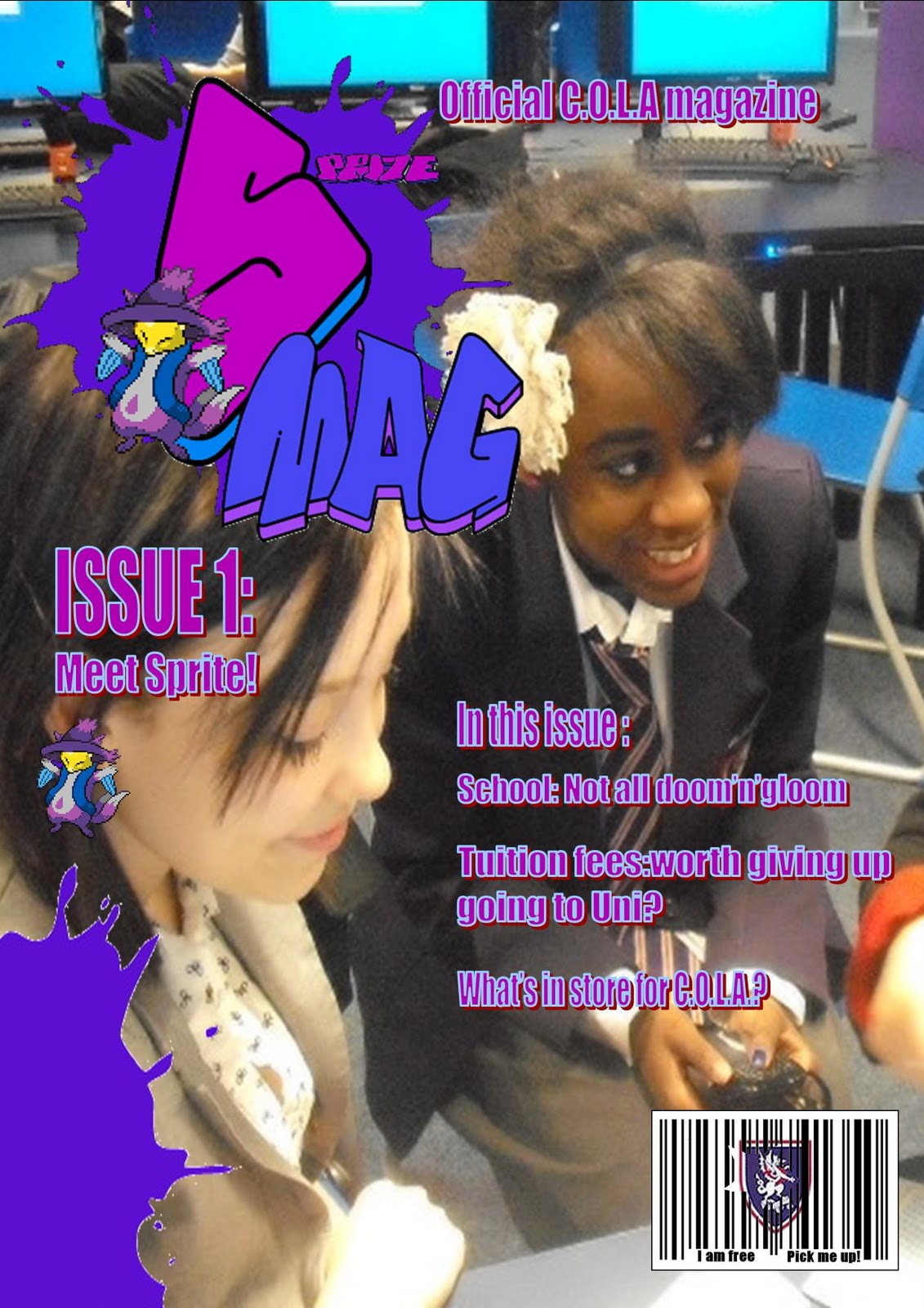
During the actual design process, I had to consider, (in my opinion) 3 main aspects: colour scheme, logo and the main image (had to be an original, mid close-up of students). For the colour scheme, as I was focussing the magazine on my own school (The City Of London Academy), I decided that for it to relate to the school and establish a connection between the magazine and the school, I decided to have purple (similar to the schools blazers) as the base colour for both the logo and basic colour scheme. I used the colour purple as it allows the target audience to make the connection between the school and the magazine making it apparent that it is THE school magazine. For the logo, I decided on two factors: Font and image. For the font, I decided to use a graffiti font suggesting creativeness (complimented by the paint splat decals) as well as giving it an urban feel which is relevant to the school’s location. For the image, I decided to created a mascot/figurehead for the magazine (known as Sprite as he is a sprite (a 2D digital image)) so that it could be associated with the magazine even without the cover or text. The aim of the design of the character was to give the target audience a more friendly and approachable image to the magazine. I believe that this was done effectively as the feedback I got from peers stated that “it gives a friendly feel to the magazine” and “shows a fun and less serious side to the school”. This view was presented to me especially from younger years (7 & 8) who were still new and a bit intimidated by secondary school and felt that the mascot showed a more approachable side to school. As for the main image, the criteria was an original mid close-up of students in the school. To fit the image in with the main article “School: Not all doom’n’gloom” the photo I took was representing students enjoying themselves and having fun during school hours. The image was used to back up the idea that school can have a fun and more laid back side. Finally, I added a “gag” to the front cover in the form of a bar code. However as the magazine is free (feedback from the questionnaire informed me that students were more likely to read the magazine if it were free) it portrays the school logo breaking through the barcode. As well as this, where the numbers usually are under the barcode, the words “I am free…pick me up! Are stated. This adds a comedy to the element adding ever more to the friendly image of the magazine. Due to a lot of positive feedback of my first contents page, I decided to make it my final contents page as well as suiting the front cover very well. Overall, I feel very happy with the final products as I believe they have suited the preferences of my target audience thanks to my research.
During the course of this preliminary task, I have leaned many skills including effective research and how to find the preferences of the target audience which will greatly benefit me during the real task. However, for the next task to improve I plan to use more sophisticated design programmes such as Adobe Photoshop instead of Microsoft Paint and Publisher (the programmes I previously used) for a more sleek and professional look. I also plan to manage my time more effectively and meet my deadlines so tasks do not build up. Despite this I am pleased with my overall performance during the course of the task.